The color of the year was recently announced: it is Classic Blue. More precisely, it is Pantone 19-4052 Classic Blue, “a solid and dependable hue we can always rely on,” described by Pantone in its annual announcement.
The description of the color by the leader of the Pantone Color Institute is awesome:
“A boundless blue evocative of the vast and infinite evening sky, Classic Blue encourages us to look beyond the obvious to expand our thinking — challenging us to think more deeply, increase our perspective and open the flow of communication.”
– Leatrice Eiseman, executive director of the Pantone Color Institute
Do you know – or remember – Pantone? Back when print marketing ruled real estate, Pantone had a lock on the color code you needed for just about anything printed.
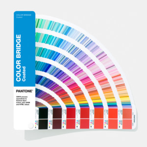
Everyone knew the Pantone number for their logo color, for example. If you published a lot of marketing materials, you probably had a Pantone color guide that you would fan out to find the right shade.
The Pantone name is trademarked as are each of their colors, their color codes – even their color management system abbreviation PMS. They control all the licensing of their colors and brand. You might even get sued for using certain colors as some are trademarked within a particular industry: Mattel Barbie Pink and T-Mobile Magenta, for example.
Pantone is still the world’s leading color standard and is making somewhat of a comeback with 3D printing. But its best PR tactic is the announcement of its color of the year.
Others have tried to jump on board with their own color of the year, including the major paint companies Sherwin-Williams, Dunn Edwards, and Behr. But their efforts feel too copycat-ish and even more self-serving to me.
Color, color, everywhere
This move reminds me of a colorful story about the island of Curacao. If you haven’t been there, my guess is you have seen iconic photos of its Willemstad waterfront. Their buildings are bright and refreshing – and highly memorable.
The legend about the origin of these colorful buildings is even more telling. Settled in 1634 by the Dutch, the only construction materials available in Curacao were extra bricks used in ships for ballast. They were combined with a lime plaster made from crushed shells. This made 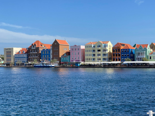 every building a brilliant white.
A former Governor of the island was suffering from severe headaches. He blamed the bright white buildings reflecting the intense Caribbean sun.
He then mandated that building exteriors be painted any color but white. Later, it was discovered that the governor was a part-owner of the island’s only paint store.
The tradition of painting in vivid colors has endured, making Curacao’s colonial-style architecture one of the most striking sights in the Caribbean.
The Psychology of Color
I first learned about color psychology while I was in Grad school at USC. I attended a lecture that discussed the relationship between colors and human behavior. I learned that for marketers, choosing the right color or colors can be a remarkably powerful tool, especially when you understand how color can help, or hurt, your efforts.
Even gender preferences are evident in color psychology. Certain colors appeal more to men than women, and vice-versa. Over the years, I have found color research to be both fascinating and helpful in guiding clients.
Understanding the role of color in culture
During my first trip to Paris (sadly, I have only been twice), I first experienced the impact of color on culture. It’s also how I become aware of the power Paris had on the entire fashion world.
As I trekked through the city, I kept seeing the color purple everywhere. It seemed that just about every Paris fashion store window featured a purple outfit of some kind. And it was all the same purple: deep, bright, and beautiful.
At the time, purple was not a dominant color in US fashion by any means. But two years later, purple dominated US fashion. I remember starting to ask friends who traveled to Paris what color was being featured in the fashion store windows, and they had an immediate response. I also found it to be pretty accurate that we would see that the same color dominates our fashion trends in the US a couple of years later.
The bottom line is we often take the impact of color for granted, but it is, in itself, a powerful communications tool. Every year, Pantone reminds me of this important lesson.


