In describing the selection of the Color of the Year 2022, Pantone notes, “We are living in transformative times.” Like the hue of the newest color of the year – Very Peri, a muted purple tone – that may be an understatement!
For those needing the Pantone number for their next printing project (wait, does anyone print much anymore?), it is Pantone 17-3938 on your Color Guide.
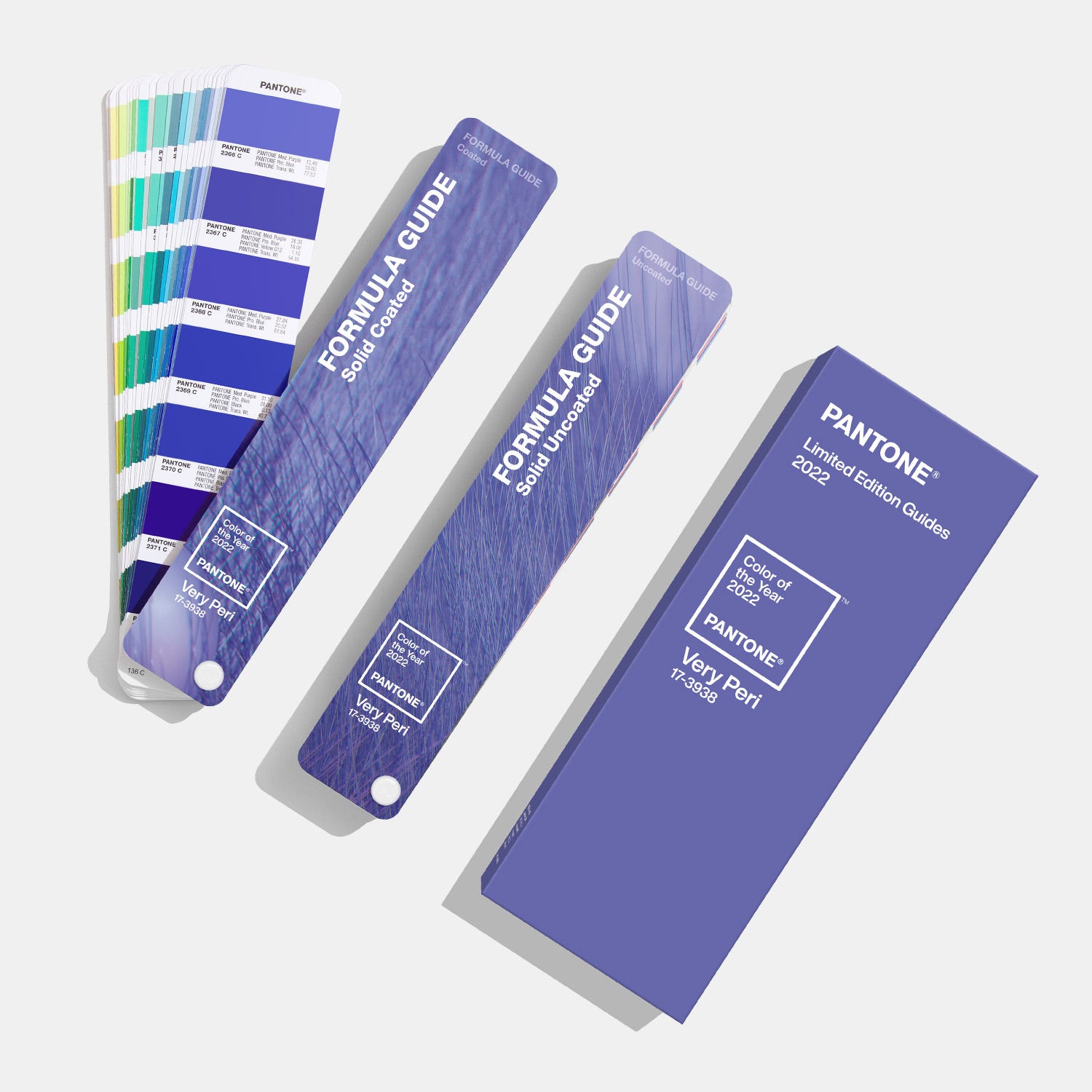
Don’t have your formula guide? You can get this special edition “Color of the Year” one at B&H in New York City for just $188 plus shipping.
Back to the newest color of the year, Pantone also writes, to introduce its 2022 color selection:
“Displaying a carefree confidence and a daring curiosity that animates our creative spirit, inquisitive and intriguing Pantone 17-3938 Very Peri helps us to embrace this altered landscape of possibilities, opening us up to a new vision as we rewrite our lives. Rekindling gratitude for some of the qualities that blue represents complemented by a new perspective that resonates today, Pantone 17-3938 Very Peri places the future ahead in a new light.”
It looks a lot more purple than blue to me, but okay, perhaps blueish purple. Or are all purples blue to designers? Call me confused.
Then Pantone goes a little too deep for me with this descriptive insight:
“Very Peri is a symbol of the global zeitgeist of the moment and the transition we are going through. As we emerge from an intense period of isolation, our notions and standards are changing, and our physical and digital lives have merged in new ways. Digital design helps us to stretch the limits of reality, opening the door to a dynamic virtual world where we can explore and create new color possibilities.”
Get the picture? If not, they even created a video of the color, I-kid-you-not, because you have to have a video for a launch, right? Here is the video:
Finally, except for the fact that no one in the world should have in their quote a product number – twice – I do admire the intent of the view from Leatrice Eiseman, Executive Director of the Pantone Color Institute.
She says, “As we move into a world of unprecedented change, the selection of Pantone 17-3938 Very Peri brings a novel perspective and vision of trusted a beloved blue (sic) color family, encompassing the qualities of the blues, yet at the same time with its violet red undertone, Pantone 17-3938 Very Peri displays a spritely, joyous attitude and dynamic presence that encourages courageous creativity and imaginative expressions.”
Who knew you could get all of THAT from a color called Very Peri? Now you know.
Check out more thoughts on the impact of color here.


